PURE TEEZ is a London-based t-shirt store launched by photographer, Mark Colliton. There are few details on the website but here’s what I found on Facebook:
Our aim is to create simple but effective & intriguing t-shirt designs, hand screen-printed to order on the finest quality vintage style unisex shirts.
Tell us more guys!
PURE TEEZ T-Shirt Review

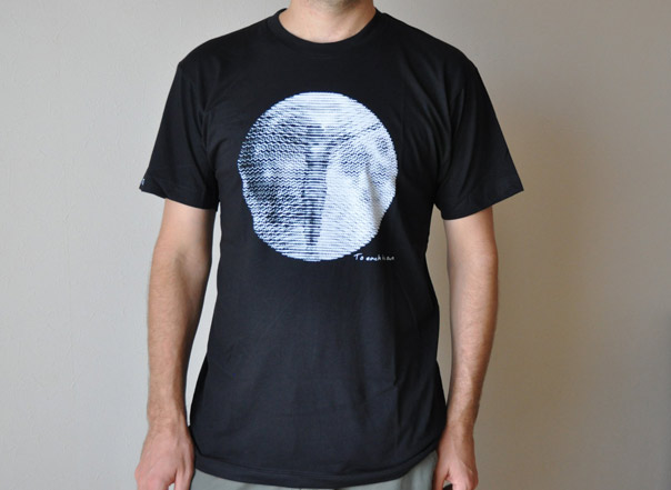
This tee arrived in the mail a few weeks back. It’s a light black poly-cotton tee. It’s very soft in a way that 100% cotton rarely is. The screen-print is also ultra soft. There is quite a bit of white ink on the black tee as you can see but it is a perfect print: the white is vivid and the black isn’t fading through. Here is what they have to say about the printing process:
Designs are hand screen-print transfers using eco-friendly inks which produce a matte print & soft feel for a vintage look.
I’m not sure I agree that it has a vintage look but perhaps some of the other tees in the store do. Their heather tees (which are a different blend) probably do.
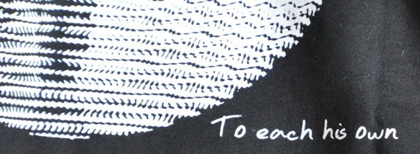
The artwork appears to me to be a vague silhouette of Jesus Christ on the cross. The large circle could be a representation of Earth but perhaps I am reading too much into it. To the bottom right there is the text “To each his own” in a simple handwriting font.

OK, not being a religious person, this is not something that I would wear. It might start conversations that I don’t really want to have. But I do like the style. Perhaps there is a different message in there that I am missing but if I am missing it and seeing Jesus on a cross, so will other people.
Branding

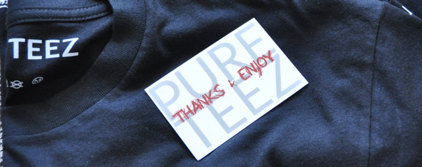
The PURE TEEZ logo is not really a logo. Just PURE TEEZ in a simple Sans font. This non-logo is used as branding on one sleeve and on the inside of the tee with the care instructions. On the inside of the tee it is almost a requirement but I think that the logo is so simple it doesn’t look good on the sleeve. It’s just some unnecessary text on the sleeve. I’d create a new logo or keep it off the visible parts of the shirt.
Extras

There was just a small business card with the tee. Keep it simple and keep the costs down at the same time. I throw out most junk anyway.
Website
The website is simple and clean easy to navigate. The homepage has a slideshow of some of the tees on offer. Of course if you are the impatient sort you might not know that it’s a slideshow because there don’t seem to be any navigation/control buttons. The slides can be clicked and just in case you couldn’t figure it out there is text to tell you. I’m not being sarcastic here. This is a good idea.
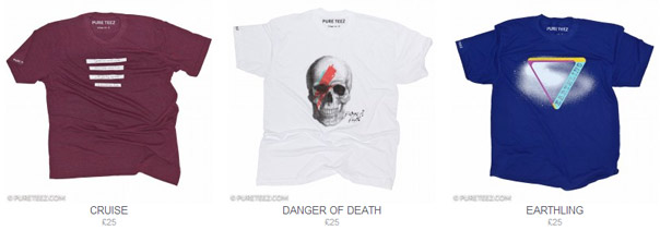
There are 16 tees spread out over 3 pages. I think they could all be on one page to save people a few clicks and the product pages have great images. Photography by Mark Colliton. Mark tells me he launched the brand so perhaps he is also the t-shirt artist. He certainly can take a photo.
There is a dearth of information on the website and not only do I like to know more about a shop before I purchase from it, I feel more confident shopping there if there is a human aspect.
Selection
At the moment there are 16 t-shirts, as mentioned above. They are all unisex t-shirts, which probably really means something like “Sorry ladies, we didn’t have enough money for ladies cuts too” or “we are all men so don’t really know what kind of tees ladies want.” It’s ironic that I was sent the one t-shirt from their collection that I wouldn’t be comfortable wearing.

Pricing
£25 (about US$39 at the current exchange rates) is pretty steep for a t-shirt. But perhaps that’s the norm in the UK for an indie brand. And Sterling is quite strong recently.
Wrap-up
The tee I received was impeccable; light, soft with clean stitching and perfect soft print. If this is the standard you won’t be disappointed by the quality. PURE TEEZ make the kind of tees that I like to wear with simple but interesting designs. The website is too impersonal and the tees are a little pricey for my taste though.
PURE TEEZ: Website | Twitter | Facebook | Pinterest


very nice collection and color i like it