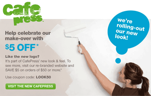
In the last few months there has been a lot of seemingly minor activities happening at Cafepress. I didn’t even guess that they were in the process of redesigning the whole web site but that is what they have done. I think it looks great. The site is clean and easy to navigate. The old site design was very clean too but it had a rigid appearance whereas the new store looks more free. Thankfully, apart from the search bar and the top buttons on the sidebar they have skipped that whole Web 2.0 look that has really started to annoy me and even they were done in such a way as to almost match the new look. A lot of people aren’t so happy with the new logo but I really don’t think it matters. People come for the designs, not the Cafepress label. As long as our designs and items are presented better they should sell better and I think the faded tones and a weak-ass logo (sorry CP) will help the customer focus on the designs.
To celebrate the new look Cafepress has provided us with coupons although you have spend over $50 to avail of the $5 off. There may be other conditions too.
There seems to be a game of one up going on with Zazzle and Cafepress which is good for everybody as far as I can see (with the possibe exception of Zazzle and Cafepress). It should create better conditions for shopkeepers and shoppers alike. Zazzle revamped their image a short while ago too. I wonder what is coming next from the big Z? (See next post.)


what an UGLY logo they made… goodness, it makes it look like they can’t print letter without mucking the color up – hey cafepress – leave the designing to the real sellers, not some goofy photoshop design someone sent in – butt ugly.
I like the soft colors, but the designs doesn’t inspire high quality printing.
good review.