Colour is Sound is a Brighton, England-based t-shirt store that specializes in t-shirts inspired mostly, but not exclusively, by British indie bands.
We’ve been creating original t-shirt art silk-screen printed by hand since December, 2015. Made in Brighton, we dare to be different- fusing art, ethics, fashion, music, conceptual design and stylistic innovation to sell ethical clothing and wall-art inspired by some of the most influential music ever made.
Colour is Sound T-Shirt Review
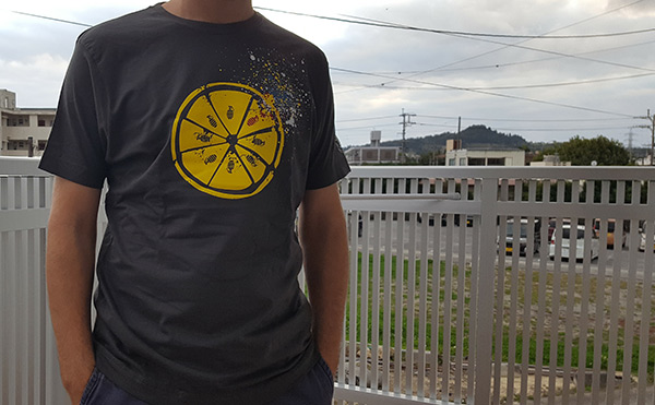
This medium-sized charcoal gray t-shirt arrived in a branded cardboard box a few days ago. It’s a light cotton and slightly loose-fitting t-shirt made in Bangladesh by the Continental Clothing Co.
An ethical British business; all our garments are made from 100% combed cotton jersey and endorsed by the Fair Wear Foundation, our T-shirt boxes are 100% recyclable.
It’s a soft cotton tee with an original 4-color design on the front in plastisol (correct me if I am wrong) ink. As is often the case on dark t-shirts, the ink is a little thick in order to maintain vibrancy but not in a very noticeable way. Still, it’s a soft and comfortable t-shirt with a decent cut.
T-Shirt Design
T-shirt Art inspired by the insurrection in Paris 1968 which so influenced the lemon and paint game changer which was the Stone Roses first album. Art freed from the frame.
I know of the Stone Roses but I am not all that familiar with their music. I do know that I am supposed to be grateful for them for paving the way for other bands I did use to listen to in the 90s. The t-shirt design is pretty cool, though and it is definitely something that I could wear. It looks like the cross-section of a lemon with hand grenades for seeds with one red hand grenade possibly representing an explosion emphasized by the paint splatter. Perhaps a Stone Roses fan could enlighten me in the comments.
Update ( I have been enlightened.):
The lemon was used on the first Roses LP. Inspired by the story told to Ian Brown ( Roses singer) by someone who was present in Paris in 68, that they used to suck lemons to counter the effects of the CS Gas thrown at them by the Police during the state of emergency declared by the French Government.
The blue white and red paint splashes represent the French flag and the art of Jackson Pollock whose work so heavily influenced John Squire (Roses guitarist and creator of the bands artwork)
(The fist is a tribute to the Situationist’s who were heavily involved in the civil disobedience movement of 68. The Roses, like the Happy Mondays and Joy Division are from Manchester in the North of the UK- these bands all featured in our Northern Lights series 1, 2 or 3. Series 1 sold out and will never be reprinted – so those who have them have a collectors item!
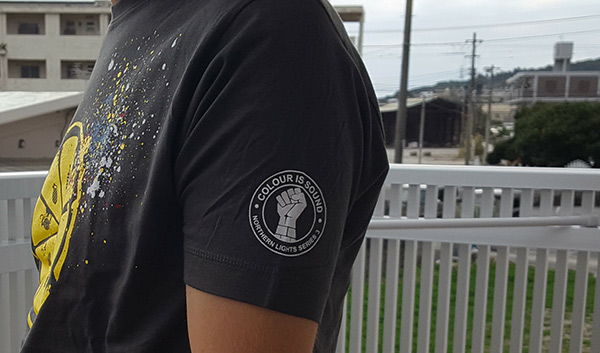
There is also a logo print on the arm. Looks pretty good. Not sure what the “fight the power” fist is about, though.
This is not the t-shirt for me simply because I am not a Stone Roses fan but if I were a fan of the Stone Roses, this is exactly the type of t-shirt I would want.
Branding and Extras
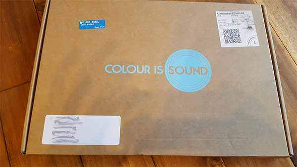
On the t-shirt, there is the sleeve logo as seen in the photo above. It’s OK but unnecessary. On the neck, there is nothing but an M tag and on the inside seam near the bottom of the t-shirt, there is a Continental logo tag along with some care details and the Fair Wear Foundation logo. The t-shirt arrived in a simple brown box with the Colour is Sound logo in blue. It looks pretty good and would look a little classy if you were to send the t-shirt as a gift. Better than a plastic mailer, for sure.
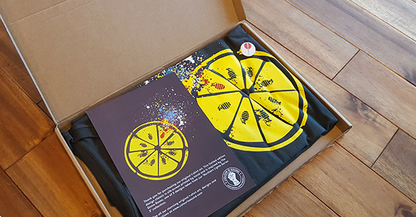
When I opened the box I was greeted by a card with details about the t-shirt design and a Colour is Sound logo button (badge). It looks good. The button is also professional looking.
The description reads:
Thank you for purchasing our original t-shirt art. This limited edition design classic is silk-screen printed by hand and is inspired by the Stone Roses, one of 3 designs taken from our ‘Northern Lights Series 3’ collection.
There was also a letter and a photo of the founders (I think). But this was information for the review. One thing I noticed in the letter that I thought was funny was the line:
Have a wonderful Festive break and may 2018 bring you smiles and high fives all round.
Of course, the 2018 was probably a typo but it could also mean that they have already written off 2017 and they wouldn’t be the only people.
Website
They have a beautiful website. One thing that I would change is to either add infinite scrolling or add all the products to one page and use lazy-loading. We can only see 6 products per page. One other thing I would definitely change is the dark filter over the images when being viewed on smaller screens. You don’t want to make potential customers squint.
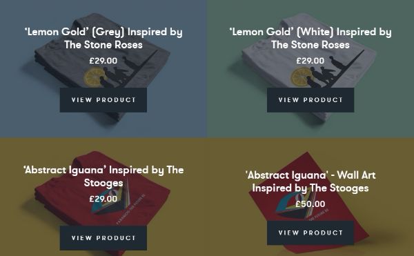
I guess the darkening of the background is to ensure that the text is legible but there has to be a better solution.
There are 20 t-shirts which make a pretty small selection but they are all excellent and original designs. I’d love to see them expand their selection. They have a blog that is not used simply to promote their products but to talk about what they love, which happens to be music. Great! I love it when people understand how to blog. Posts like that are much more likely to drive customers than promotional drivel.
Pricing
The shirts are £29.00 each which is about US$36 at today’s exchange rate. They are not cheap t-shirts but I think in the UK, no one would blink an eye at the price. And if you consider that they are using fair-trade cotton and not mass-producing you might consider it a good deal. And it’s unlikely that you’ll meet someone on the street with the same t-shirt as you.
Wrap-Up
It’s a nice t-shirt with an original and interesting design. They have a beautiful, modern, and well-maintained website. They have a small selection of t-shirt but in an interesting niche. If I were them, I would try to get some licenses to create official designs because then they could really take off. Most official designs suck and Colour is Sound could show them how it should be done.


Great review, honest, detailed and in-depth. Much appreciated, Steve, Colour Is Sound. (And the shirt looks great on you!)
(The lemon was used on the first Roses LP. Inspired by the story told to Ian Brown ( Roses singer) by someone who was present in Paris in 68, that they used to suck lemons to counter the effects of the CS Gas thrown at them by the Police during the state of emergency declared by the French Government.
The blue white and red paint splashes represent the French flag and the art of Jackson Pollock whose work so heavily influenced John Squire (Roses guitarist and creator of the bands artwork)
(The fist is a tribute to the Situationist’s who were heavily involved in the civil disobedience movement of 68. The Roses, like the Happy Mondays and Joy Division are from Manchester in the North of the UK- these bands all featured in our Northern Lights series 1, 2 or 3. Series 1 sold out and will never be reprinted – so those who have them have a collectors item!
to subscribe to our music blog https://colourissound.com/pages/sign-up
And thank you. And that makes the design even more impressive. I’ll add the comment to the content of the post. Thanks again.
These t-shirt are excellent with excellent material and fabric.last 30 days i have existing this t clothing to my husband and he really like this and purchase more.
A very in depth review, Thanks for sharing and the images are also very great, This t-shirt is really made of great material. Just purchased this for my brother and he loves it very much
It is a soft t-shirt.
Thank you for the feedback , much appreciated SIddhi, Colour Is Sound is a soulful endeavor and its pleasing to get such positive feedback. We’ve got new designs inspired by the Ramones and Oasis. They look amazing!! Peace – Steve – Colour Is Sound
Very nice and detailed review, Thanks for sharing
Thanks Rahul! Much appreciated