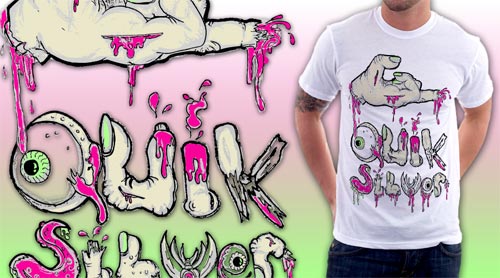
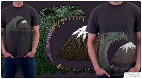
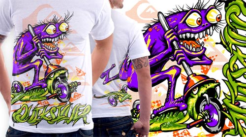
As I briefly mentioned back in February after my short break from blogging Design by Humans was holding a contest in collaboration with Quicksilver. Today the three winners have been announced. They are all pretty solid designs but not what I would wear.
I noticed though that the three designs that were chosen by Quicksilver (not Design by Humans) have caused a bit of a stir in the DBH forums. The designs that were chosen, in particular, 1st and 2nd place, didn’t garner many votes which at DBH are used to judge how popular a shirt might be. Some of the designers are upset that designs with higher votes weren’t chosen with some people citing examples that they feel are more worthy of glory.
14 votes and 3 comments for the win. Wow. Congrats to the winners.
If QS was going to choose the winners, why they put this competition on a design comunity for ppl vote on?
it’s cleary that the votes here doesn’t mean anything, with in my opinion, it’s kinda disrespectfull with DBH users…
i like the winners, specialy the second, but i would be very frustrated if my design gets 200 votes and loose for a design that gets 14 votes
Other people are upset because the chosen designs don’t really reflect the theme of the design. Below are some of the comments.
If they was about just any quiksilver design, they schould not mantion the Foundation of Tony Hawk for the contest…they needed to say “any crazy style is wellcome”.
i dont see the essence of Design a Difference or the Tony Hawk FOundation in them.
Anyway, here are the three winning designs.


Please comment with your real name using good manners.