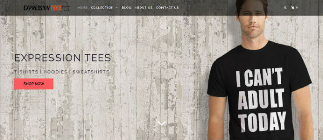
Expression Tees is an online t-shirt and apparel store based in New York. They seem to specialize in text tees featuring slogans but there are also some pop culture references and other themes like politics too.
Do you want the best, newest, funniest shirt designs on the web? Expression Tees has what you are looking for. Expression Tees opened for business with one focus: wowing our customers with trendy designs and even greater customer service.
Note: As changes were made while I was reviewing Expression Tees some parts of the review might be confusing. It’s good that Expression Tees are actively working to improve their website.
Logo
It’s not bad logo if you can see it. On the website, it is quite hard to make out. I like the fact that the t-shirt icon has eyes. It has an expression and they are Expression Tees. Very clever.
![]()
That said, it’s not a very good logo either. Even when you can see it, I don’t think it’s particularly memorable. They need to give their concept to a new logo designer and see what they come up with.
Site Design
The design of the site needs some work. It’s quite generic and despite being responsive a lot of elements don’t seem to fit well. On my 1080p monitor, a part of the image of a featured design is cut off and then lower on the page some of the Game of Thrones text is cut off. (Banner removed.)
The missing Instagram feed throws off the balance of the site. (Feed working now.)
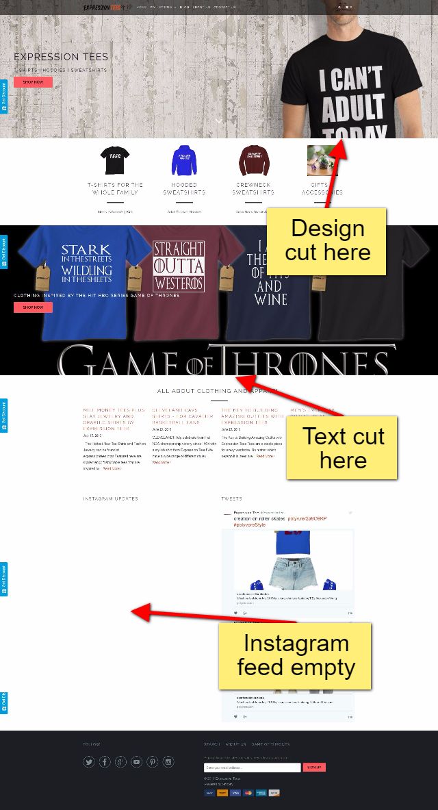
I also find the various text and image sizes a bit off-putting. I think they have a mobile first attitude because it looks better on a mobile device than on my monitor. It’s probably just the result of the theme they chose. The mobile experience is not perfect either, though. On my mobile device, the Game of Thrones text is cut off too and we only see “ME OF THR”. (Banner removed.) On top of that, the actual text (rather than a text image) is sitting on the t-shirts making it practically illegible.
OK, so I’ve been quite negative but it’s not all bad. The site is easy to navigate and the store layout is very clean and uniform as is the product page. I’m guessing this is a print-on-demand service because they use mock-ups instead of actual product shots and you can select from a range of colors. Also, they have a huge selection of mediocre designs, many of which, I imagine, have never sold or will ever sell.
Product Images
As mentioned above, the product images are all mockups and they all look like mockups too. I think this can be off-putting to many people and they could do better. Still, I have seen much worse and they probably give a fairly accurate representation of what the t-shirt will look like.
The T-Shirts
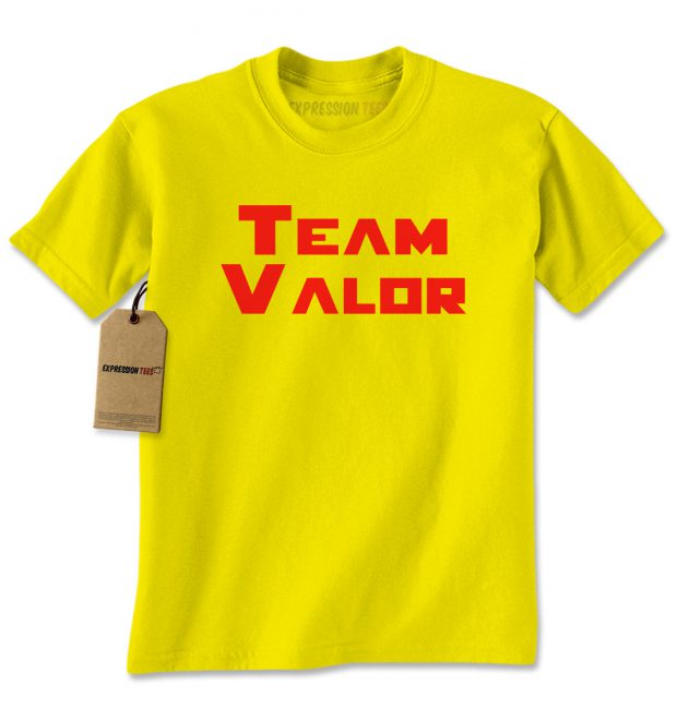
They have slogans and they have trendy pop culture references (Game of Thrones, the Walking Dead, Pokemon GO) and politically themed t-shirts (Trump vs. Clinton). So they are jumping on the bandwagon which is fine. Popular topics are more likely to sell, so why not. There is not much originality and they are clearly not employing a talented designer.

Most of the designs are one color and simple. By the way, I love the door stopper Hodor concept.
Shopping Cart
The store is powered by Shopify and it has a great shopping cart. No complaints. You can pay by credit card, PayPal or Amazon.
Navigation
It’s not difficult to navigate but there are a few things that should be changed I think. I would change the text from Collections to Store or Shop. Make it obvious that you have something to sell. I like that the dropdown gives you the option to go to a particular category. You want to get your customers to products with as few clicks as possible. With that in mind, I think that the collections page is superfluous. It adds another click and is a little confusing. It looks like the catalog page for a t-shirt printing business. You know the kind of business where you get your family vacation t-shirts printed.
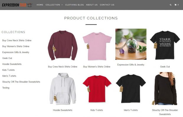
They could just show a catalog of all the products and then the site visitors can use the side navigation to filter if they are looking for something specific.
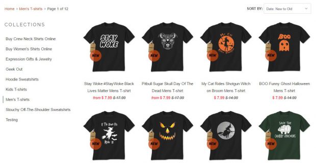
Note: This has been updated. It’s like they were reading my review as I was writing it. Nice.
I would put the link to the blog back in the navigation to make it easier for people to find.
One bug I noticed is that when you click on the search button, a search bar appears in a pop-up. The cursor automatically goes into the box so you type your search term right away. That’s a good thing. But if you close the search bar without searching, the navigation background disappears making the navigation text almost disappear.
The search bar should be more obvious too because there is a pretty good collection of t-shirts.
They might also want to add more tags or better descriptions because my search for “election” didn’t turn up many results despite there being a few t-shirts in this category and it being a very topical issue.
SEO
The homepage needs more static text focusing on their keywords, whatever they are going to be. It’s very tough to stand out in the t-shirt market but you need to make an effort. It would be very difficult to rank for “text t-shirts” for example but if you don’t try it will be impossible. I would pick out the t-shirts that are selling the best and concentrate on increasing traffic to those shirts as well promoting them more on the homepage. It’s great that they have text from the blog appearing on the homepage because Google loves pages that are updated. (The text has been removed from the homepage and now there is just a title and link. As well as a featured image for one of the posts. I would add back the text.)
From what I can see, there are only two themed collections.
- GAME OF THRONES
- MUSIC & MOVIE THEMED T-SHIRTS
The GAME OF THRONES collection doesn’t really have any SEO attached to it and the MUSIC & MOVIE THEMED T-SHIRTS collection has some text but no t-shirts. That’s bizarre. I would recommend adding more sections and categories like these and add a lot more descriptive text. And of course, make sure there are t-shirts in them.
The product pages have plenty of text and most of it about t-shirts, which is great, but I think they need more text about the design.
Almost all the pages need to have unique and relevant page titles as well as a good meta-description so if they do manage to rank well in Google and some see their link, they will be convinced by the description that this is the page they are looking for.
I don’t know how much control they have over images in Shopify but they need some work. For example and image named “MensHeatherGrey_25167b0a-5b99-4878-8207-ffae3bd78d41_1024x1024.jpeg” could be named “straight-outta-westeros.jpeg”. At least its alt tag was decent: Straight Outta Westeros Mens T-shirt – Expression Tees – 4.
Expression Tees Blog
They also have a blog which can be accessed from the homepage. It’s updated a couple of times a month. They always seem to feature something to do with Expression Tees which I think is a mistake. It’s not a problem to mention Expression Tees but no one (except the owners of Expression Tees) want to read articles about Expression Tees. A blog should be used to attract people to your site so you need to make interesting and/or useful posts. If people like your blog they’ll keep coming back and they might eventually take a look in your store and buy something.
One title they use “DIFFERENT WAYS TO INCORPORATE EXPRESSION TEES IN YOUR SUMMER OUTFITS” for a post is practically useless with regard to SEO. No one but the owners of Expression Tees would search for this. Something like “T-Shirts and Summer Outfits” might work better. Forget using Expression Tees in your titles and text and think about phrases that people might actually search for. Target those phrases and write a great blog post to go with it.
Selection and Pricing
There seem to be over 400 designs available on t-shirts, sweatshirts, and hoodies. You can even select from a range of colors. That is a big selection and one of the benefits of a print on demand service. They can increase their selection without actually worrying about excess inventory. A problem with this system is that designs that are not very good are often put on sale just because it costs nothing. I didn’t look at all the designs but as I was flicking through, nothing really got my attention. Nothing except the price.
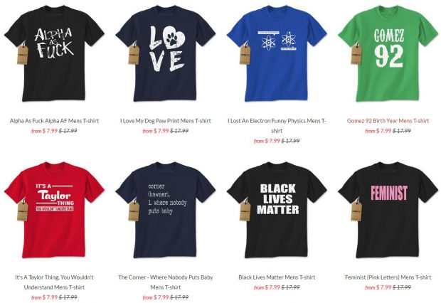
The t-shirts regular price is $17.99 but they are all on sale for just $7.99 at the moment. That is a bargain and I think that if you are in the market for some cheap t-shirts then you will probably find something you like here, especially if you are a fan of one color slogan designs.
Social Media
Expression Tees has a strong social media presence with almost 5,000 Facebook fans, 1,566 followers on Instagram, 2,900 followers on Pinterest, and 89 Twitter followers. OK, so the Twitter account needs some work, as does their Google+ account. Social media is a bit of a mystery to me so there is not much advice I can give here. Follow and engage with accounts you are interested in and always respond to comments.
Facebook | Twitter | Instagram | Pinterest | Google+ | YouTube
Wrap-Up
Expression Tees are doing a lot of things right. They have a reasonably modern and easy to navigate website. Albeit slightly generic. They have a decent, regularly updated blog and social media presence. They have a huge selection of reasonably priced t-shirts and a shopping cart that just works.
The t-shirt designs suffer from the same problem as the website. Topical but generic and unoriginal. They need to focus on successful categories, improve the SEO and promote and highlight those. I would also start writing less self-indulgent blog posts in order to get people interested in what they have to say.
Link: Expression Tees

Hey Tee Reviewer,
Thanks so much for reviewing our site. We are relatively new to the space, so you’ve given us great direction on where to start making improvements. As you noted in the review, we were even working on it as you were typing haha. Glad you were able to point us in the right directions on what to focus on first.
Best of luck to you, great site/blog!