Kempo24 is an apparel, accessories, and home goods online store that ships from two locations in the US and from Latvia in Europe. They specialize in mostly one or two color designs with a graphic and some text.
We want to remind about your childhood, make you smile or even reconsider a view.
Our mission is to be able to design the things we love and the way we like to, while keeping the prices fair.
With every design we publish we want to tell you a good story.
Come sit down with us and listen to our tales.
Logo
 I like the logo. It has a cool retro and vintage look reminiscent of a wax seal. There are also shades of a Japanese stamp type seal which they might be going for because there is some Japanese text in the lower half of the logo. As I said, I like the logo but I think it works better in the larger sizes that you can see on their social media accounts that on the website. I would increase the size and center it on the page so people would really notice it in order to help increase brand recognition.
Site Design
In general, the site design is OK. When you arrive at the homepage, it doesn’t take you a second to know that this is a place where you can buy t-shirts and if you scroll down you can see that there are other products available too. But it’s very busy and the design rules are inconsistent. And even without scrolling down I can see at least 8 different font sizes with various font types. I really think that websites promoting/selling art should be as simple as possible and this is especially true for the home page.

This is from the homepage. It’s crowded, looks tacky and the t-shirt image is so small I have no idea whether I would like it or not. So basically I would need to click on each t-shirt and visit each t-shirt page (there is no preview) individually to check them out. If that’s the case, then we don’t need the t-shirt name or price on the home page. Unless there are a substantial number of reviews I wouldn’t put the ratings on the home page at all. The “Almost Gone”, “New”, and “Best Seller” tags are ugly and non-uniform which irritates me.
That’s me being harsh but here’s my advice. Get rid of all the text for these products and increase the image size by about 3 or 4 times so that the shoppers can see the design clearly and will know if they are interested without having to click on the links. Frankly, if the shopper is interested in the product, the price (within reason) will not be a deal breaker. And people already know in general how much t-shirts cost. If you want to have “Almost Gone”, “New”, and “Best Seller” tags, overlay them on the large images.
The homepage slider needs to be re-thought. I like the Ashton Kutcher quote. It’s relevant but the first image should definitely clearly feature at least one of the products available in the store. And it should be clickable so that the shopper can easily find the featured product. There are also strong arguments for just removing sliders from your website. I’m not going to get into it here but you can Google it to find out what I am talking about.
Later on the homepage, there is an image inviting you to join the mailing list and if you click on it a form slides on to the bottom of the page. They should have just put the form directly on the page where people and enter their email and click send. And I recommend offering a coupon for first-time buyers. Or simply for joining the mailing list if you can afford it.
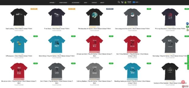
The t-shirt selection page is full width and responsive but those images are just too small even on a 27- inch widescreen monitor.
The product page is not bad but could be better. When you click on the image to get a closer look, it’s not easy to understand how to get back to the details. I think that it would be better to have images that are already big enough to see the details so you don’t feel the need to click on them. Or perhaps one of those rollover effects that zoom in on the image. The latter is not a solution for mobile visitors though.
Product Images
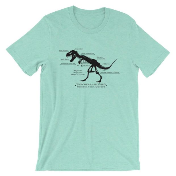
The product images are pretty good. They are mockups but I think that they give a good idea of what they will look like and with the increase in print-on-demand sites mockups are pretty much the standard now. Some model shots or possibly even customer submitted images would be cool though.
The T-Shirts
As mentioned above, most of the designs are one or two color graphics with text. None of the t-shirts really stood out. I didn’t see anything where I thought to myself that I must have it but they are mostly the type of t-shirts that I like to wear. Simple, clever and non-pop culture. They do have a few vague pop culture references but there are a variety of themes to cater to different people like cat-lovers, coffee addicts, and err.. fishermen.
I didn’t look at every t-shirt in the store as it is tedious to open every page in the browser to get a closer look. Yes, this is my way of reiterating that the thumbnail images need to be much bigger.
I know that they use both Gildan and Bella+Canvas t-shirts but I guess they might use other brands too, depending on where the t-shirts are produced and shipped from and other factors.
Shopping Cart
The store is powered by Shopify and it has a great shopping cart. You can pay by credit card or Amazon. The shop prices are in Euro by default but you can switch to various currencies including USD but I noticed that when you get to the shopping cart, it reverts to Euro. It’s not a problem for me but just something that you should be aware of when you are checking the total including shipping. And I’ll mention here that the shipping cost of €4,32 (US $4.99) for one t-shirt to Japan is awesome. It’s slow but I’m patient.
Navigation
The navigation is well done and it’s very easy to find whatever you are looking for both on PC and mobile versions of the site. On the PC version, the dropdowns even reveal some sample products that you might be interested in.
SEO
This is a tough area for almost any website but the competition in the t-shirt industry is fierce so SEO is particularly difficult to do successfully. I’ll talk about a few things that can be worked on, though.
First of all the home page title is Unique Fashion & More! Find creative Thirts, Mugs, Poster & Gift Ideas. For SEO benefit, I’m sure misspelling T-Shirts doesn’t help but let’s imagine that the spelling is correct. Then the page title is accurate. What it says is what you get but the problem here is that these are not terms that people search for. I think that text would work better as a meta-description than as a page title. The page title is vitally important for search engines whereas the meta-description is just what the search engines i.e. Google might choose to display under the link to your site. It might have an impact on the click-through rate. The phrases “creative t-shirts” and “gift ideas” are OK but it will be very difficult for a small site like this to compete for those terms.
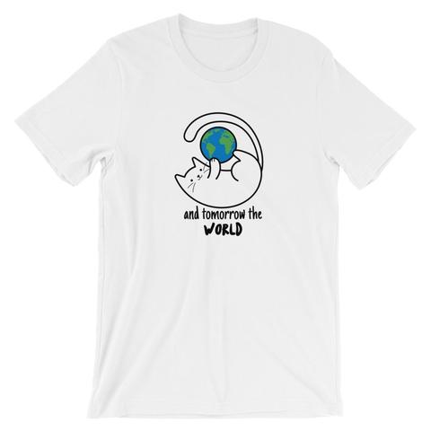
Look, it’s going to be difficult to rank for any generic terms and Kempo24 already ranks for his brand so not much work needs to be done there. I would work on writing long and detailed descriptions of the designs using long tail keywords or phrases. For example, for the following t-shirt design, the phrase “cats world domination” or something similar could be used in combination the word t-shirts. There are already some results for that but I think they are not so strong and I think that with a bit of creativity, Kempo24 could rank for that term easily enough.
Of course, a regularly updated blog would help get traffic to the site, too. Kempo24 has a Tumblr but it’s not that easy to optimize for SEO purposes and I think it can be used in tandem with a regular blog.
Selection and Pricing
There are about 60 designs, so that’s 60 different t-shirts as well as a host of different products. That’s a decent selection for an independent store. And the designs cover a variety of topics so it’s not a bad place to go for gift shopping. At less than US$20 per t-shirt the prices are very reasonable and, as I discovered, the shipping fees are also reasonable, even international shipping.
Social Media
Kempo24 has a pretty good social media following. They have over 15,000 followers on Instagram, nearly 1,000 on Facebook. They are also active on Pinterest and Tumblr. Curiously, there is no Twitter account that I can see. Possibly because the @kempo24 handle had already been taken.
Facebook | Instagram | Pinterest
Wrap-Up
Kempo 24 has a good selection of t-shirts that cater to a lot of interests even if the designs are somewhat generic. They are reasonably priced and the shipping rates are pretty good too.
https://www.instagram.com/p/BmxgQayHJxh/
I recommend tidying up their website by simplifying and removing unnecessary elements. Above all, make the images bigger and clearer. The mockups are nice, clean and realistic but lack personality so Kempo24 should consider adding images from their Instagram account like the ones above or below this text.
https://www.instagram.com/p/Bmp-JiZH_Sv/
Link: Kempo24

Please comment with your real name using good manners.