
Lost Propertee is a new t-shirt store that focuses on weird designs from around the world. I think that they curated a lot of designs but are also accepting submissions. Of course you will be paid if your design is used.
If your design gets picked to go online we will make you a free t-shirt and pay you a royalty on each shirt that we sell.
Logo
This is what I call a non-logo. I utilize a similar non-logo on the Shirt List. It’s simple but doesn’t stand out. Probably took someone 2 minutes with Photoshop to create. For a website that promotes weird designs, I think that they could spend more time and effort on creating a suitable logo. The white logo on the black page makes it luck sinister too. If that’s the look they are going for, they have succeeded. It’s not the way I would go though.
Site Design
It looks as if as little effort was put into the site design as the logo. Yes, I mean very little. The basic concept of this web design is black background with white and red text. The red text is used for important text such as the shopping cart links and prices.
I usually prefer dark text on light websites but sometimes light on dark works. This is not one of those cases though. Perhaps the #000000 Black and the #FFFFFF White is just too much of a contrast. It hurts my eyes and I wouldn’t want to stay on this site for very long.
The layout is a mess too. It just appears so slapdash. It’s great that there is a slider on the homepage showcasing various t-shirts from their site but it might be too big depending on what monitor you are using. On my desktop it is fine but on my wife’s laptop some of the slider is below the fold, hiding the navigation.
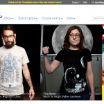
The slider images themselves should be better. This is your homepage. You want people to be so impressed by the first slide that not only do they want to click on it but they will come back to the homepage to see the other slides. Lost Propertee does have some good slides but the first one is ugly as hell. Compare these three home page sliders. These screenshots are displaying what I see above the fold on this laptop.
If I were doing the website I would pick some of the best-selling designs and feature them on the homepage in clear images on actual models and make each tee click through to the t-shirt product page.
The t-shirt catalog and product pages break the previous design choices by being white boxes on the black page. The one good thing about is though is that reading dark text on the white background doesn’t make your eyes bleed.
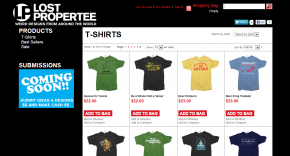
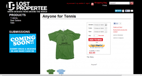
But still, as you can see, it isn’t very pretty. And it’s quite old-fashioned.
For the blog, they really need to read this article about Typography and Spacing by Brian Gardner.
Product Images
The product images on the catalog are, for the most part, too small which means that you will need to click on them to see what they are about. I think the images on the product pages themselves are also too small but at least you can click on it to see a larger version in an AJAX pop-up. Wouldn’t it be better to save visitors that extra click though, and have a good size image in the first place? I think so.
The images themselves are all mockups and are actually just using different colors of the same mockup so it will be clear to the conscientious visitor that they are fake. That said, the mockups are well done and look like they could be closely copied when actually being printed. What I am saying is that I believe the actual product won’t differ greatly from the mockup.
The T-Shirts
They have an eclectic bunch of designs that vary from cute to weird to slightly offensive yet somehow they all seem like they are in the right place. You know, like the X-Men. They all have vastly different personalities but together they can take on the world…or something. (I probably shouldn’t use comic book analogies considering I don’t know much about them.)
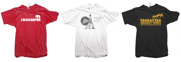
Actually the t-shirts are what make Lost Propertee and that’s the way it should be but if you had a website that complimented it you would make more sales.
We use Gildan 6400 Super Soft Style Tees for all of our t-shirts.
Shopping Cart
The cart is simple and easy to use. It clearly shows what you have added to the shopping cart for review before you pay and you can pay via debit/credit card or PayPal.
Navigation
The navigation may not be pretty but it is simple and that may be more important. The one thing that I might worry about though is that people might not realize that it is a navigation. The standard location for navigation is in the header area and the links are simple unstyled text. They are large and easy to see though so perhaps I am worrying about nothing.
SEO
I was going to say that they need to focus more on relevant keywords like t-shirt and apparel but it’s pretty difficult to rank for those words. The competition is fierce. So perhaps they are on the right track focusing their attention on weird designs.
There is a blog which could help with SEO but it’s not well done. They need to use more images and more text. And they don’t need to simply post about events in their company. Post about related topics or things that you think the people who buy your t-shirts would be interested in. That will keep your current customers coming back and attract like-minded people through Google.
I couldn’t even see a way to subscribe to the blog by RSS.
They need to add more text to the home page. It could be added to the slider if they have the right slider software/plugin. And I would add product descriptions to the individual t-shirts as well. In the blog occasionally link to the products using similar text and don’t forget to use title tags on the links. Don’t overdo it though.
On the product pages add the word “t-shirt” or something similar after the t-shirt name to try get some hits from that.
Selection and Pricing
There is a pretty decent selection on offer considering that it’s a fairly new store. Each comes with about 3 color options for the tees. This might mean that they are using DTG instead of screenprinting. Or perhaps not because it looks like some displayed colors are not available (Why display the option if is not really an option?) and the size range is different for some tees. Lost Propertee might clear this up for us. I couldn’t find the details in the FAQ.

International shipping charges are crazy (to Japan anyway.) The tee prices are reasonable at about $20-$25 but the cheapest shipping to Japan is $34.50! That’s just silly but not the first time I have come across such crazy shipping charges.
Social Media
I had to do a Google search to find the Lost Propertee Facebook page. Enough said.
Link: Facebook
Wrap-up
They have some pretty cool tees but the website doesn’t present them very well. I think the first thing that Lost Propertee should do is make their website more presentable and use larger images to display their tees and designs. Then focus on SEO and promotion through social media. This type of slogan tee might do well on Pinterest but a combination of the major social media outlets should help get the word out.
Links: Store | Blog



Please comment with your real name using good manners.