This post is more for POD shopkeepers than customers. Little did I know when I went to bed last night that my world (the POD part of it anyway) would be changed. I have stores at both Cafepress and Zazzle so these changes are very interesting for me.
First I will talk about the changes at Zazzle (good news first). Zazzle posted on their blog about the Gallery Updates but they should have called them Gallery Upgrades (for the most part) in my opinion.
Firstly Zazzle has increased the size of the product images which is great. I feel that over at Cafepress the product views are too small and it is hard to see the design, so bigger is better. On the other hand the Zazzle product views were a pretty good size anyway and if I hadn’t been told I might not have noticed that they were bigger (15% bigger). What I don’t like though is the white border that now appears on rollovers. I think the white border would be OK if the inner image background color filled the whole square.

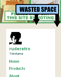
 Secondly, the side bar has been made slimmer to accommodate the larger images. I actually think this doesn’t look so good. At least on my store. I also think it may have been unnecessary as there is some wasted space around the whole page and also the images could have been moved a little closer together without looking bad. If you have long section titles this means that they will run onto two lines and can sometimes be a little confusing. They have recommended keeping your section titles to less that 20 characters to prevent this occurrence but we shouldn’t really have to do that. Section titles are not just titles they are SEO tools.
Another cool upgrade is the ability to have a 100px high header which is great. The 200px header was excessive and pushed the all important products down the page, which is why in my store I put product and design images in my header. Pity they are not clickable though. Now that would be a real improvement. Also we now have the ability to put the sidebar on the left or on the right. That’s pretty cool. But which is better? I’ll let you decide.

Another thing that has been mentioned in their post is the ability to make your store private which might be useful for some people. The ability to make a section private would be useful for many people though. And finally the the “Manage Your Gallery” top bar has been removed (thankfully) and the functions have been moved into the shopkeepers control panel. This will only be noticeable to shopkeepers, not shoppers.
Something that wasn’t mentioned in their blog post is the fact that the links to view all products have been removed from the page. You can still see all products by clicking on the “Products” link on the side but I think that the original links (above and below shop front images) were more likely to be clicked, which makes it more likely that someone will buy something from your store. (*edit I was told that this was a glitch and it is already back on-line).
As this post took longer than I had expected I will talk about the dramatic changes that happened over at Cafepress last night in the next post. If I missed anything or if you have any opinions or feedback please post a comment. Don’t forget to take part in the Sidebar Poll.


Please comment with your real name using good manners.