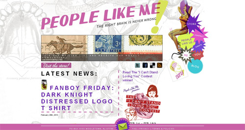
This is one of these websites that popped into my inbox when I really had no time. If I said that I was still trying to catch up it would be kind of a lie as I pretty much given up on a lot of emails that I received last month. So if I haven’t replied to you or posted about your tee/tee store/tee contest you may want to contact me again.

Anyway, People Like Me has a wild website. One that goes against almost everything I believe in design-wise. It’s chaos in there. No symmetry. Different font sizes. Small product pictures. I could probably go on but the real point is that somehow despite all these things that would drive me crazy if it were my website I like it. It just works.
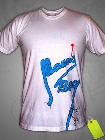
As for the few t-shirts that are for sale in the store (It’s new.), at first glance I nearly dismissed them. Of course the small and lo-res images don’t help but they are not bad. The designs are not amazing but they do have a nice helping of humor and not your typical college humor either. Check them out. I’m looking forward to what they come up with next.


Please comment with your real name using good manners.