 ShirtFix is a t-shirt database created by Joris De Groot in 2010. It is now on version 3. He wants it to be the Google for shirt people. I guess that means that he hopes that when people want to find a particular shirt or browse shirts in a particular category that they will go to ShirtFix. It’s an ambitious goal.
ShirtFix Website Review
ShirtFix is not a t-shirt store so the ShirtFix t-shirt review will have a slightly different format but regardless I’ll still focus on ways to improve the site.
Logo
The logo is not bad. The concept is clever enough I guess but somehow it doesn’t seem to work. Perhaps it’s because there is another “i” in the text that is not a syringe. The balance is off or something. I’m not sure. Or perhaps it is simply the suggestion of hard drugs and addiction which have very negative connotations for me and for most people I guess. It could be that the coloring and layout remind me of one of my own even more poorly designed logos of the past. The coloring and font are similar.

On the other hand, perhaps the logo is just fine but it just looks lonely up there on the top left-hand side of the screen and the muted colors don’t help either.
Site Design – Home Page
If you have been reading my reviews you know that I am a big fan of white space and ShirtFix has plenty of white space on the homepage but it’s not really working. It looks like there was a big white canvas but not enough elements to go on it. See the image below. (Please ignore the blue boxes.)
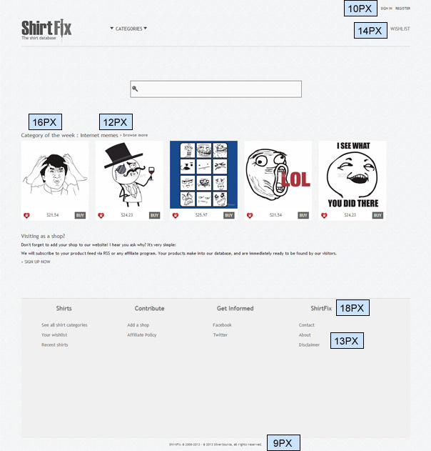
There is text of varying sizes scattered about the page. I counted 7 sizes (not including the logo which has another 2): 9px, 10px, 12px, 13px, 14px, 16px and 18px. You might get away with varying font sizes if you had something to keep them apart but there is very little on this home page apart from the text. There are a logo, five images, and a search box. At first glance, you might think it is some type of meme search engine (or meme generator) because there is not one t-shirt image on the home page and the category of the week is internet memes.
I would add text into the search box that says something like “Find great t-shirts!”. The great big search box in the middle of the screen is very Google (well not the big part) but ShirtFix isn’t Google yet. They need to give people a reason to search. Or at least tell them what they might find if they do. (There is an automatic javascript tooltip when you first visit the site but blink and you’ll miss it.)
Site Design – Product Pages
The layout of the t-shirt pages is a bit better. I wouldn’t go so far as to say it’s pretty but it is functional and informative and the purpose of the page is clear. There is a comment about the t-shirt, information on how much it costs and where you can get it. There is a Buy It button that is easy to see. You can see related shirts to the right-hand side and previously viewed shirts below.
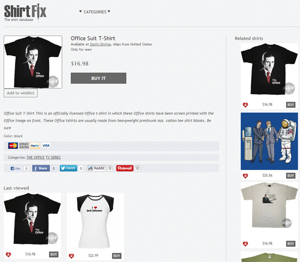
There is easy access to share buttons for people to spread the word about t-shirts they like. Recent trends in web design say that the text could be bigger.
Site Design – Category Pages
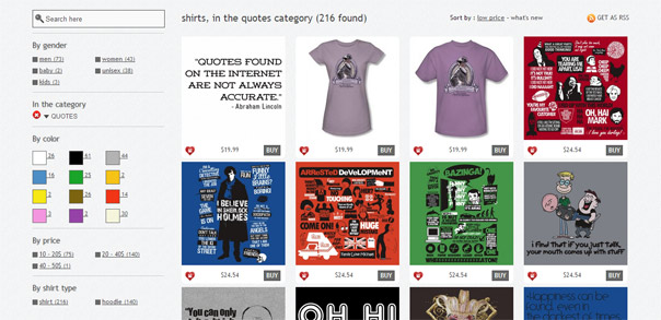
The category pages are the best part of the site and basically, have the same structure of the search results page. After you choose a category or search for keywords you will get a list of thumbnails with several options on the left to narrow down your results. You can narrow them by gender, color, price and shirt type. For search results, you can also narrow them by category.
If you roll over the thumbnail you can see a larger version of the thumbnail (at least in cases where the full-sized image is larger than a thumbnail).
On the top right-hand side, you can sort by relevance, price or newness. And there is an option to subscribe to all new t-shirts in that category.
Product Images
There seem to be no rules when it comes to product images which means there is no standardization. Sometimes the full-size image is merely a thumbnail as you can see in the product page image above. Sometimes it is simply a design, which you can see on the homepage image above (the memes). Sometimes there are decent sized images. I like uniformity.
Navigation
There is not much to navigate on this site so it is pretty easy. There are some seemingly random categories in a dropdown and easy access to important links in the footer. If I were ShirtFix, I would go more Google and put the most important links on the top of the page. Just make sure to keep it tidy.
And why not have a search bar on every page?
Search Engine
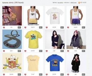
The search engine is easy to use and has tons of results, just like Google. Unfortunately, just like Google, the further down the results you go, the less relevant they become. Take the first image below as an example. The search was “banana” and there are 395 results over 17 pages. On page 12 there 24 t-shirts of which I think only 6 were relevant. Some of the items are not even t-shirts. Of course not too many people are going to go to page 12 but the number of search results is a bit misleading.
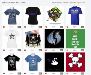
There are 6833 results for Star Wars over 275 pages but by page 40 anyway (I just randomly checked) there are t-shirts featuring just Stars or even Star Trek. Yowzer!
That said, I was able to find relevant results for everything I searched for. Unlike Google, though, if you make a spelling mistake you may get no results or suggestions.
SEO
The SEO needs a bit of work. The product pages are not bad. They have good page titles and h1 tags and often pretty decent descriptions. I bet that most of the descriptions were simply scraped from the product site via product feed and I am pretty sure that Matt Cutts from Google Webmasters fame said that unless you add some unique content that it won’t help you much.
Unique meta descriptions should be added to the product pages too so that people would be more likely to click on them in the search results.
The home page titles need work and perhaps more descriptive text should be added.
The category pages also would benefit from more text. For example, the page title is “shirts, in the artistic category” but who really searches Google using a string like that. Of course a simple “Artistic T-Shirts” would have much more power. But on such a broad topic with many powerful websites fighting for position, you would definitely need some complementary text.
Wish List
I love the wish list feature. If you see a tee you like, all you have to do is click on the heart and it will be added the wish list. It works whether you have registered or not but if you don’t register it certainly won’t save your wish list forever. I imagine it will disappear once your cookies have been deleted. It doesn’t say but I imagine it you are logged in it will save your wish list permanently.
Selection
There is a huge selection of tees on ShirtFix and you can probably find tees for any topic you search already. I think that this is mainly thanks to product feeds from stores like CafePress [removed before this post was published], Stylin’ Online, RedBubble, ChoiceShirts, and CBSSports.com Fan Shop, all of which stock a huge variety of tees. ShirtFix allows you to search them all and more from one place. But is that a good thing? It seems to me to be a quantity over quality thing here.
According to the About Page ShirtFix was actually preceded by allshirtshops.com in 2008. Its goal was initially to gather all the nice T-shirt shops from all over the world. That sounds like a pretty nice goal but that is clearly not the goal with ShirtFix. The goal seems to be to gather all the nice t-shirt shops.
Social Media
ShirtFix is on Twitter and Facebook and both are updated a couple of times a month. Despite having accounts since 2010 they don’t seem to have been active during 2011 and much of 2012 and they haven’t gained much of a following yet. The Facebook page currently has just 12 likes and just 8 followers on Twitter. Maybe 2013 will be their year.
Wrap-Up
Basically, I think that everything on this site needs work. From the design to content to social media to the aim. I think that the design can be very simple and plain because the product being promoted (t-shirts) tends to be very colorful but that doesn’t mean that design can be ignored.
It is implied in the About Page that they want to showcase the best t-shirts on the web and perhaps they are in there somewhere but if they are, they are being drowned out by a multitude of low-quality designs from print-on-demand companies like CafePress and RedBubble. I think that Joris needs to re-evaluate the purpose of the website and get more focused. At the moment it is a mess with much better alternatives. In fact, Google itself is a better alternative for looking for t-shirts.
Links: Website | Twitter | Facebook


Please comment with your real name using good manners.