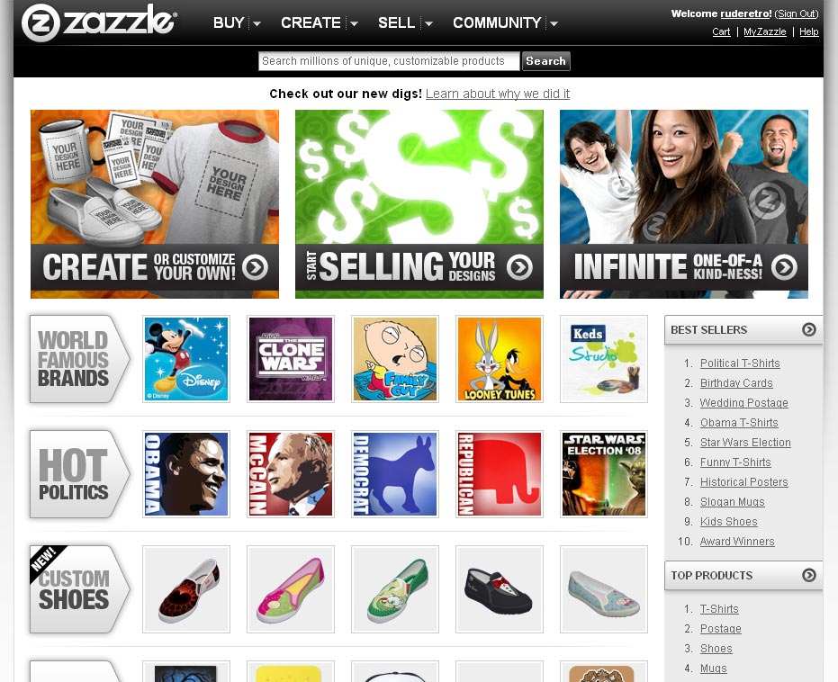
I got a bit of a surprise when I was checking out my stores a few minutes ago. One second I was looking at the familiar sight of the what has just become old Zazzle branded page and the next I am looking at a darker vision. Do I like the new look? Yes, I think so. Am I happy with the change? No. Reasons below.
Zazzle’s explanation for the change is… I’ll just post an excerpt below.
Zazzle is much less interested in promoting itself than it is in promoting our users and the content they generate. This overhaul of Zazzle’s identity is intended to create a brand that allows us to step back from the limelight so that your content takes the center stage.
If this is true how come the new Zazzle branding takes up more space than the old one? How come the new logo is bolder than the old one? Why is the Zazzle marketplace search bar featured more prominently than before? As mentioned in a previous post called 10 ways to improve Zazzle, I think that Zazzle has too much branding and too many leaks from our stores and now the leak that I hate most of all, the Zazzle marketplace search, is sure to draw more of our customers away from our stores than ever before. If Zazzle really wanted our content to take center stage they would really reduce the size of their branding and get rid of those leaks. I believe with Printfection and Spreadshirt you can remove branding totally from the page but don’t quote me on that. Even Cafepress’ branding is subtle compared to Zazzle’s.
That’s the branding and the search bar but there is also the web design here. A simple rule is to keep important content high on the screen but our content has just been pushed a little further down to make room for Zazzle’s new look and search bar. If Zazzle really wanted to promote us and our content why is our content being pushed down the screen?
This is the old branding below and what the header used to look like.

This is the new header with the new logo, look and more prominent search bar.

The Zazzle home page looks very good though and is much more attractive than the previous text heavy version. I prefer the image based home page but that is just a visual thing. I thought that the changeover was for SEO purposes. I wonder why the about face.


Meh – the new logo is a step back. The old one looked far more professional, now it looks kind of amaturish.
I liked the old logo too.
If you add “?zbar=true” to your links to your gallery then you’ll get a much shorter header w/o the “leaks”
@BenMVP – doesn’t seem to work for me. No change on my homepage and it takes away my header on the other pages, leaving only Zazzle’s branding, not mine.
* Shaking my head. That search bar is irking me every time I open up my Gallery.
I liked their previous logo too – it said Zazzle to me. I was more aware of the brand by looking at it.. now I’m not getting as much back.
I agree with all the points in your post.
I liked the old logo beter too. I agree it was much more professional looking and not as intrusive. I feel like the new branding focuses more on the Zazzle identity than making my content take center stage. 🙁
I’m really hating the new search bar.
Posting this on GG, but doesn’t the new logo remind you of the old “nytol” commercials.. where the pill is an N and turns over into a Z? I swear it reminds me of that!
Another thing that irks me about the ‘it’s about you..’, the main page is created so that your eye is drawn to ‘create your own’ stuff and ‘sell’ your stuff, I didn’t even notice where you can search and BUY stuff until I looked a little harder.. they do not draw a lot of attention to it at all.
@RudeRetro – the new zbar that I was talking about is explained in the Zazzle forum: http://forum.zazzle.com/feedback/introducing_the_zazzle_zbar. There is sometimes some weirdness when I have my ZoneAlarm settings too restrictive, but it usually works fine for me.
Maybe you ran into the bug they described?
Zazzle just don’t get it do they.
No, they really don’t. We can see from the zbar that they have the ability to reduce the branding in our stores to something similar to Cafepress’ level yet they don’t have it as standard. Just flick the switch Zazzle and you will make a lot of Zazzle shopkeepers very happy. With the zbar it has to be that someone comes to your store using a specially created link to get the reduced Zazzle branding version. That’s BS. The reduced branding should be the standard view or else all their talk about “promoting our users and the content” is just that – talk.
I’m assuming that the fact that they say it’s “FREE to contributors” is implying that other sites charge for this sort of functionality?
Or that they were considering charging for it?